

Juniper Tree Healing
The Brand
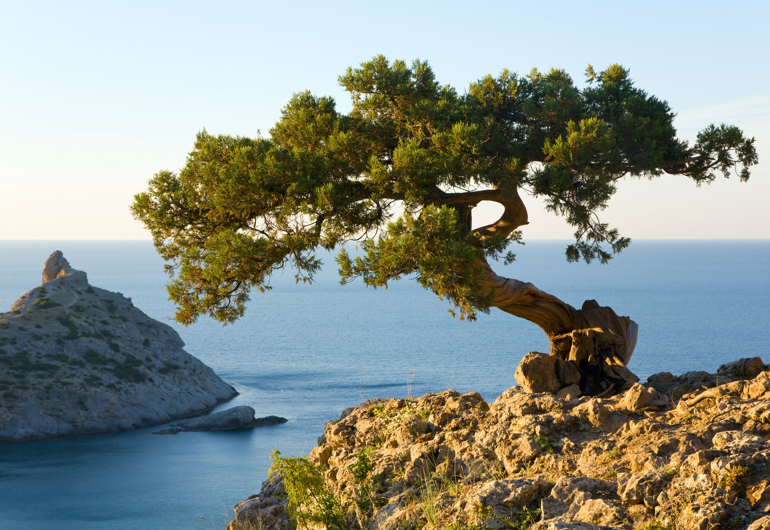
Why a juniper tree?
A Juniper, with its resilient and evergreen nature, is a symbol of strength and enduring support. The tree's deep roots, coupled with its welcoming presence, evoke feelings of security and create a comforting atmosphere - a crucial element for giving individuals the support and safety they need to get through a challenging time.

What is the purpose?
During this process I wanted to focus on the element of the juniper tree itself. As a therapist, your occupational goal is to provide unwavering support for those going through difficult times. That meant that the brand needed to convey a sense of security and trustworthiness.
The logo
Thought Process
Since the juniper tree is the center piece behind the brand, it only made sense to incorporate it into one of the designs. The logo speaks to the qualities of the juniper tree while keeping a calm, easy to read typeface for both. I chose to simplify the alternate logo for easy readability and simplicity for stationary.
Main Logo - Version 1
Main Logo - Version 2
Icon Variations

Alternate Logo
Main Logo - Tagline

Alternate Logo - Tagline
~
typography
~ typography
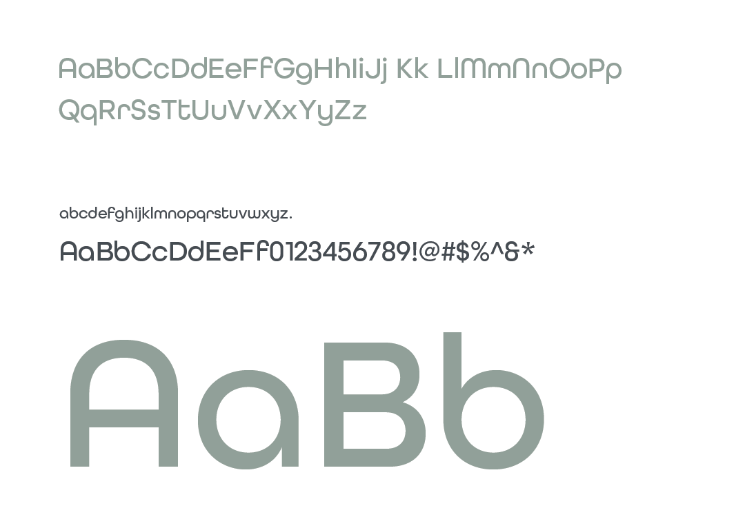
Primary: All round gothic
The All Round Gothic typeface was chosen as a complimentary element for the brand’s identity. It’s clean and a modern aesthetic bringing a sense of contemporary clarity to the communication of the brand. It is simple, yet versatile in many ways, making it a great option for a variety of applications.
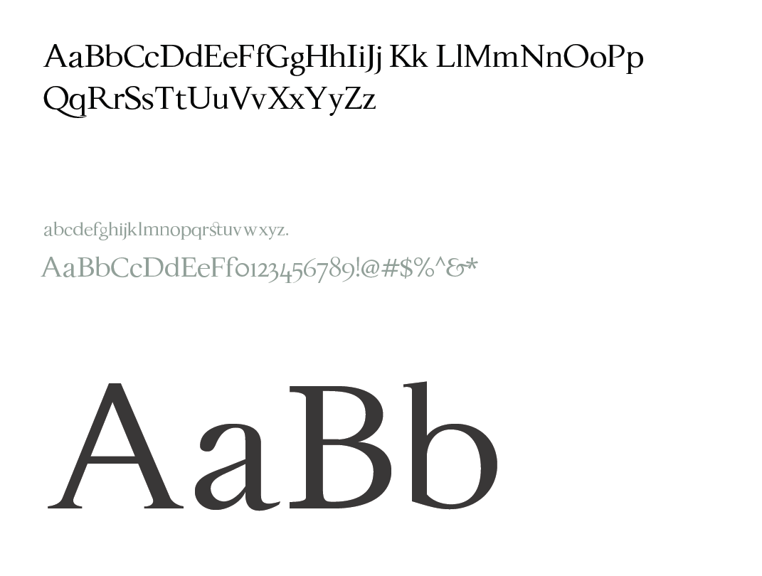
secondary: festina lente
Festina Lente became the secondary font for this brand because of its sophistication and approachability. It is an elegant serif font, aligning seamlessly with the brand’s core values. This typeface reflects the enduring nature of a juniper tree and contributes to the overall identity of the brand.